

CASE STUDY #5
How Might We Reimagine the Future of Mobile Experience?
Setting the Premise
As mobile use continues to rise at an exponential rate, I felt that it would be better to abandon the old hamburger navigation layout. In terms of navigation, websites should be arranged in a way that is comparable to that of an app experience. This was a project that I was incredibly enthusiastic about initiating inside the Marketing team, and it was one that I was able to do so.
What I did
Discovering and ideating | Prototyping| Data Analysis
Probe & Learn
Analytics Review
The initial step in this undertaking was to go back to the original data source. To determine whether or not it is even worthwhile from a business standpoint to invest in this. And, second, to understanding of our mobile data use trends.
With the help of Google Analytics, I was able to determine the total amount of data pointers. Here, I create typical dashboards and reports, which I use to carefully watch and monitor the data that I'm interested in. Data points such as the number of visitors split by device, the types of sites that people visit on mobile devices, the sizes of the devices, how well our existing navigation is performing, the data points for each navigation menu choice, and so on.

Key Insights
Everything was created and shared via the use of a Google presentation, which was hosted on Google Slides. I presented information that went beyond simple numbers and included studies on and reasons for the importance of navigation, such as the thumb zone, how people hold their phones, the amount of growth that mobile marketing will see in the future, the distraction that people experience while using mobile, and so forth.
Rather than just viewing the problem through the lens of statistics, the stakeholders were able to perceive the frustration from the perspective of the users. I highlighted to them how the faults identified may have an impact on their potential customers' perceptions of the brand, not just in terms of conversion rates, but also in terms of their overall impression of the brand.
-
We received nearly 24% of traffic from mobile devices.
-
Among that nearly 65% of it contributes to blogs.
-
The menu CTA was the most frequently/popular element people clicked on.
-
Almost 86% of our prospects were using more than 5” inch mobile screens.
Goal Defintion
Goal
-
The main priority is to focus on findability.
-
The general rule is to keep frequently used links in the easy-to-reach zone and to keep infrequently used links in the hard-to-reach zone.
Use Cases
The hypothesis was defined based on each use case such as:
-
Personalized experience
-
Blog/Landing page with the goal of increasing conversions
-
Blog/Landing page with the goal to promote ebooks/webinars
-
Blog page with the goal to increase the number of pageviews
-
-
NonPersonalized experience
The metric plans different based on these use cases.
Collaborate & Build
Inspiration Gathering
It took me some time to put together a list of references from our competitors and other brands that I thought would be interesting. The goal of the task was to find patterns that users were already familiar with. This includes both apps and websites references.
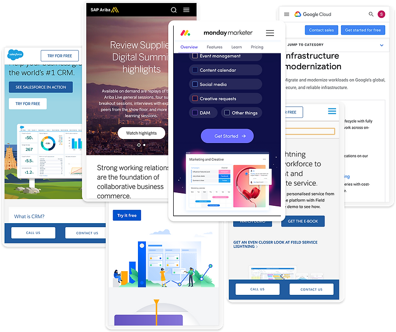
Wireframes and Mockup
Use case #1: Blog/Landing page with the goal of increasing conversions
I designed two variants. One with the hamburger menu, with the sticky footer CTA. And the other, instead of the hamburger menu displaying the frequently used menu option as tab/label outside the hamburger menu. And have the least used menu option inside the hamburger menu.

Use case #2: Blog/Landing page with the goal to promote ebooks/webinars
Similar to that of use case 1, expect the sticky footer CTA would have options based on the type of page. For example, if it's a landing page for an ebook, you have a "Download ebook" button at the bottom, or if it's a documentation page, why not put the search bar at the bottom of the screen? This way, people can search for what they need.

Use case #3: Blog page with the goal to increase the number of pageviews
We may use this to encourage readers to explore similar stories rather than scrolling all the way to the bottom, or to encourage visitors in the transaction blog to either signup or be sent to the appropriate landing page in order to increase conversion rates.

Use case #4: Non-personalized experience
The amount of time and effort to build the use case 1-4 would be significant, and we need tremous support from across different teams such as the SEO, paid, design and tech. Based on which i design another version called “non- personalized” which means the same Ui will apply across all the pages.

Outcome
I have displayed these stakeholders and marketing team. Despite our best efforts, we were unable to proceed from that point forward. However, this is a project that I am still quite interested about completing it.
CASE STUDY #1